Widgets
The uiSchema ui:widget property tells the form which UI widget should be used to render a field.
Example:
const schema = {
  type: "object",
  properties: {
    done: {
      type: "boolean"
    }
  }
};

const uiSchema =  {
  done: {
    "ui:widget": "radio" // could also be "select"
  }
};

render((
  <Form schema={schema}
        uiSchema={uiSchema} />
), document.getElementById("app"));
Here's a list of supported alternative widgets for different JSON Schema data types:
For boolean fields
radio: a radio button group withtrueandfalseas selectable values;select: a select box withtrueandfalseas options;- by default, a checkbox is used
Note: To set the labels for a boolean field, instead of using
trueandfalseyou can setenumNamesin your schema. Note thatenumNamesbelongs in yourschema, not theuiSchema, and the order is always[true, false].
For string fields
textarea: atextareaelement is used;password: aninput[type=password]element is used;color: aninput[type=color]element is used;- by default, a regular
input[type=text]element is used.
String formats
The built-in string field also supports the JSON Schema format property, and will render an appropriate widget by default for the following string formats:
email: Aninput[type=email]element is used;uri: Aninput[type=url]element is used;data-url: By default, aninput[type=file]element is used; in case the string is part of an array, multiple files will be handled automatically (see File widgets).date: By default, aninput[type=date]element is used;date-time: By default, aninput[type=datetime-local]element is used.
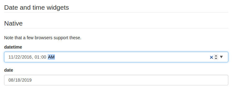
Please note that, even though they are standardized, datetime-local and date input elements are not yet supported by Firefox and IE. If you plan on targeting these platforms, two alternative widgets are available:
alt-datetime: Sixselectelements are used to select the year, the month, the day, the hour, the minute and the second;alt-date: Threeselectelements are used to select the year, month and the day.
Firefox 57 - 66: Firefox partially supporting
dateandtimeinput types, but notdatetime-local,monthorweek

You can customize the list of years displayed in the year dropdown by providing a yearsRange property to ui:options in your uiSchema. Its also possible to remove the Now and Clear buttons with the hideNowButton and hideClearButton options.
const schema = {
  type: "string"
};

const uiSchema = {
  "ui:widget": "alt-datetime",
  "ui:options": {
    yearsRange: [1980, 2030],
    hideNowButton: true,
    hideClearButton: true,
  }
};

render((
  <Form schema={schema}
        uiSchema={uiSchema} />
), document.getElementById("app"));
For number and integer fields
updown: aninput[type=number]updown selector;range: aninput[type=range]slider;radio: a radio button group with enum values. This can only be used whenenumvalues are specified for this input.- By default, a regular
input[type=text]element is used.
Note: If JSON Schema's
minimum,maximumandmultipleOfvalues are defined, themin,maxandstepinput attributes values will take those values.
Hidden widgets
It's possible to use a hidden widget for a field by setting its ui:widget uiSchema directive to hidden:
const schema = {
  type: "object",
  properties: {
    foo: {type: "boolean"}
  }
};

const uiSchema = {
  foo: {"ui:widget": "hidden"}
};

render((
  <Form schema={schema}
        uiSchema={uiSchema} />
), document.getElementById("app"));
Notes:
- Hiding widgets is only supported for
boolean,string,numberandintegerschema types; - A hidden widget takes its value from the
formDataprop.
File widgets
This library supports a limited form of input[type=file] widgets, in the sense that it will propagate file contents to form data state as data-urls.
There are two ways to use file widgets.
- By declaring a
stringjson schema type along adata-urlformat:
const schema = {
  type: "string",
  format: "data-url",
};

render((
  <Form schema={schema} />
), document.getElementById("app"));
- By specifying a
ui:widgetfield uiSchema directive asfile:
const schema = {
  type: "string",
};

const uiSchema = {
  "ui:widget": "file",
};
Multiple files
Multiple files selectors are supported by defining an array of strings having data-url as a format:
const schema = {
  type: "array",
  items: {
    type: "string",
    format: "data-url",
  }
};
Note that storing large dataURIs into form state might slow rendering.
File widget input ref
The included FileWidget exposes a reference to the <input type="file" /> element node as an inputRef component property.
This allows you to programmatically trigger the browser's file selector, which can be used in a custom file widget.
accept option
You can use the accept attribute to specify a filter for what file types the user can upload:
const schema = {
  type: "string",
  format: "data-url"
};

const uiSchema = {
  "ui:options": { accept: ".pdf" }
};