uiSchema
JSON Schema is limited for describing how a given data type should be rendered as a form input component. That's why this library introduces the concept of uiSchema.
A UI schema is basically an object literal providing information on how the form should be rendered, while the JSON schema tells what.
The uiSchema object follows the tree structure of the form field hierarchy, and defines how each property should be rendered.
Note that almost every property within uiSchema can be rendered in one of two ways: {"ui:options": {[property]: [value]}}, or {"ui:[property]": value}.
In other words, the following uiSchemas are equivalent:
{
  "ui:title": "Title",
  "ui:description": "Description",
  "ui:classNames": "my-class",
  "ui:submitButtonOptions": {
    "props": {
      "disabled": false,
      "className": "btn btn-info"
    },
    "norender": false,
    "submitText": "Submit"
  }
}
{
  "ui:options": {
    "title": "Title",
    "description": "Description",
    "classNames": "my-class",
    "submitButtonOptions": {
      "props": {
        "disabled": false,
        "className": "btn btn-info"
      },
      "norender": false,
      "submitText": "Submit"
    }
  }
}
For a full list of what is supported in the uiSchema see the UiSchema type in @rjsf/utils/types.ts.
Be sure to pay attention to the hierarchical intersection to these other types: UIOptionsBaseType and TemplatesType.
Exceptions to the equivalence
There are 4 properties that exist in a UiSchema that will not be found in an inner ui:options object.
ui:globalOptions
The set of globally relevant UiSchema options that are read from the root-level UiSchema and stored in the registry for use everywhere.
import { UiSchema } from '@rjsf/utils';

const uiSchema: UiSchema = {
  'ui:globalOptions': { copyable: true },
};
ui:definitions
The ui:definitions property allows you to define reusable UI customizations for schema $ref references. This is particularly useful for:
- Recursive schemas - Define uiSchema once for a self-referencing schema node
- Reused definitions - Apply consistent UI to schemas used in multiple places
- oneOf/anyOf branches - Provide different uiSchema for branches that reference different definitions
The keys in ui:definitions must match the exact $ref path used in the schema (e.g., #/definitions/address or #/$defs/node).
import { Form } from '@rjsf/core';
import { RJSFSchema, UiSchema } from '@rjsf/utils';
import validator from '@rjsf/validator-ajv8';

const schema: RJSFSchema = {
  definitions: {
    address: {
      type: 'object',
      properties: {
        street_address: { type: 'string' },
        city: { type: 'string' },
      },
    },
    node: {
      type: 'object',
      properties: {
        name: { type: 'string' },
        children: {
          type: 'array',
          items: { $ref: '#/definitions/node' }, // Recursive reference
        },
      },
    },
  },
  type: 'object',
  properties: {
    billing_address: { $ref: '#/definitions/address' },
    shipping_address: { $ref: '#/definitions/address' },
    tree: { $ref: '#/definitions/node' },
  },
};

const uiSchema: UiSchema = {
  'ui:definitions': {
    '#/definitions/address': {
      street_address: { 'ui:placeholder': 'Street and number' },
      city: { 'ui:placeholder': 'City name' },
    },
    '#/definitions/node': {
      name: { 'ui:placeholder': 'Enter node name' },
      children: { 'ui:options': { orderable: false } },
    },
  },
  // Local overrides take precedence over ui:definitions
  shipping_address: {
    street_address: { 'ui:placeholder': 'Shipping street (overrides definition)' },
  },
};

render(<Form schema={schema} uiSchema={uiSchema} validator={validator} />, document.getElementById('app'));
Local Overrides
You can override specific properties from ui:definitions by providing values at the field path. Local values are merged with definitions, with local values taking precedence.
oneOf/anyOf with Same Property Names
When using oneOf or anyOf with branches that have properties with the same name, each branch's $ref maps to its own entry in ui:definitions, ensuring correct UI is applied:
const schema: RJSFSchema = {
  definitions: {
    person: { type: 'object', properties: { name: { type: 'string' } } },
    company: { type: 'object', properties: { name: { type: 'string' } } },
  },
  type: 'object',
  properties: {
    contact: {
      oneOf: [
        { title: 'Person', $ref: '#/definitions/person' },
        { title: 'Company', $ref: '#/definitions/company' },
      ],
    },
  },
};

const uiSchema: UiSchema = {
  'ui:definitions': {
    '#/definitions/person': {
      name: { 'ui:placeholder': 'Full name (e.g., John Doe)' },
    },
    '#/definitions/company': {
      name: { 'ui:placeholder': 'Company name (e.g., Acme Inc.)' },
    },
  },
};
ui:rootFieldId (deprecated)
DEPRECATED: Use
Form.idPrefixinstead, will be removed in a future major version
By default, this library will generate ids unique to the form for all rendered widgets.
If you plan on using multiple instances of the Form component in a same page, it's wise to declare a root prefix for these, using the ui:rootFieldId uiSchema directive:
import { UiSchema } from '@rjsf/utils';

const uiSchema: UiSchema = {
  'ui:rootFieldId': 'myform',
};
This will make all widgets have an id prefixed with myform.
ui:field
The ui:field property overrides the Field implementation used for rendering any field in the form's hierarchy.
Specify either the name of a field that is used to look up an implementation from the fields list or an actual one-off Field component implementation itself.
See Custom Widgets and Fields for more information about how to use this property.
ui:fieldReplacesAnyOrOneOf
By default, any field that is rendered for an anyOf/oneOf schema will be wrapped inside the AnyOfField or OneOfField component.
This default behavior may be undesirable if your custom field already handles behavior related to choosing one or more subschemas contained in the anyOf/oneOf schema.
By providing a true value for this flag in association with a custom ui:field, the wrapped components will be omitted, so just one instance of the custom field will be rendered.
If the flag is omitted or set to false, your custom field will be wrapped by AnyOfField/OneOfField.
ui:options
The ui:options property cannot be nested inside itself and thus is the last exception.
ui:XXX or ui:options.XXX
All the properties that follow can be specified in the uiSchema in either of the two equivalent ways.
NOTE: The properties specific to array items can be found here. For advanced dynamic UI schema capabilities for array items, see the Dynamic UI Schema Examples.
widget
The ui:widget property overrides the Widget implementation used for rendering any field in the form's hierarchy.
Specify either the name of a widget that is used to look up an implementation from the widgets list or an actual one-off Widget component implementation itself.
See Custom Widgets and Fields for more information about how to use this property.
classNames
The uiSchema object accepts a ui:classNames property for each field of the schema:
import { UiSchema } from '@rjsf/utils';

const uiSchema = {
  title: {
    'ui:classNames': 'task-title foo-bar',
  },
};
Will result in:
<div class="field field-string task-title foo-bar">
  <label>
    <span>Title*</span>
    <input value="My task" required="" type="text" />
  </label>
</div>
style
The uiSchema object accepts a ui:style property for each field of the schema:
import { UiSchema } from '@rjsf/utils';

const uiSchema = {
  title: {
    'ui:style': { color: 'red' },
  },
};
Will result in:
<div class="field field-string task-title" style={{ color: "red" }}>
  <label>
    <span>Title*</span>
    <input value="My task" required="" type="text">
  </label>
</div>
allowClearTextInputs
The optional ui:allowClearTextInputs uiSchema directive enables a clear/reset button for text-based input widgets.
When set to true, a clear button will be displayed when the input field has a value and is not readonly or disabled.
When omitted, no clear button will be displayed for text input fields.
import { RJSFSchema, UiSchema } from '@rjsf/utils';
const schema: RJSFSchema = { type: 'string' };
const uiSchema: UiSchema = {
  'ui:allowClearTextInputs': true,
};
It can also be enabled globally by setting the allowClearTextInputs option to true in the ui:globalOptions
uiSchema directive.
import { Form } from '@rjsf/core';
import { RJSFSchema, UiSchema } from '@rjsf/utils';
import validator from '@rjsf/validator-ajv8';

const schema: RJSFSchema = { type: 'string' };
const uiSchema: UiSchema = {
  'ui:globalOptions': {
    allowClearTextInputs: true,
  },
};
autocomplete
If you want to mark a text input, select or textarea input to use the HTML autocomplete feature, set the ui:autocomplete uiSchema directive to a valid HTML autocomplete value.
import { RJSFSchema, UiSchema } from '@rjsf/utils';

const schema: RJSFSchema = { type: 'string' };
const uiSchema: UiSchema = {
  'ui:widget': 'textarea',
  'ui:autocomplete': 'on',
};
autofocus
If you want to automatically focus on a text input or textarea input, set the ui:autofocus uiSchema directive to true.
import { RJSFSchema, UiSchema } from '@rjsf/utils';

const schema: RJSFSchema = { type: 'string' };
const uiSchema: UiSchema = {
  'ui:widget': 'textarea',
  'ui:autofocus': true,
};
description
Sometimes it's convenient to change the description of a field. This is the purpose of the ui:description uiSchema directive:
import { RJSFSchema, UiSchema } from '@rjsf/utils';

const schema: RJSFSchema = { type: 'string' };
const uiSchema: UiSchema = {
  'ui:widget': 'password',
  'ui:description': 'The best password',
};
deprecatedHandling
The ui:deprecatedHandling uiSchema directive controls how a field marked as deprecated in the JSON Schema is rendered.
Accepts one of three values:
'label'(default): The field is rendered normally with"(deprecated)"appended to its label.'disable': The field is rendered but all its child widgets are disabled.'hide': The field is completely hidden from the form.
import { RJSFSchema, UiSchema } from '@rjsf/utils';

const schema: RJSFSchema = {
  type: 'object',
  properties: {
    legacyField: { type: 'string', deprecated: true },
  },
};

const uiSchema: UiSchema = {
  legacyField: {
    'ui:options': {
      deprecatedHandling: 'disable',
    },
  },
};
It can also be set globally by specifying the deprecatedHandling option in the ui:globalOptions uiSchema directive, which applies the chosen behavior to every deprecated field in the form.
import { Form } from '@rjsf/core';
import { RJSFSchema, UiSchema } from '@rjsf/utils';
import validator from '@rjsf/validator-ajv8';

const schema: RJSFSchema = {
  type: 'object',
  properties: {
    legacyField: { type: 'string', deprecated: true },
    anotherOldField: { type: 'number', deprecated: true },
  },
};

const uiSchema: UiSchema = {
  'ui:globalOptions': {
    deprecatedHandling: 'hide',
  },
};

render(<Form schema={schema} uiSchema={uiSchema} validator={validator} />, document.getElementById('app'));
disabled
The ui:disabled uiSchema directive will disable all child widgets from a given field.
Note: If you're wondering about the difference between a
disabledfield and areadonlyone: Marking a field as read-only will render it greyed out, but its text value will be selectable. Disabling it will prevent its value to be selected at all.
enableMarkdownInDescription
The ui:enableMarkdownInDescription uiSchema directive enables the support of Markdown syntax within the description of
a field.
import { Form } from '@rjsf/core';
import { RJSFSchema, UiSchema } from '@rjsf/utils';
import validator from '@rjsf/validator-ajv8';

const schema: RJSFSchema = { type: 'string', description: '**bolded** text in the description' };
const uiSchema: UiSchema = {
  'ui:enableMarkdownInDescription': true,
};
render(<Form schema={schema} uiSchema={uiSchema} validator={validator} />, document.getElementById('app'));
It can also be enabled globally by setting the enableMarkdownInDescription option to true in the ui:globalOptions
uiSchema directive.
import { Form } from '@rjsf/core';
import { RJSFSchema, UiSchema } from '@rjsf/utils';
import validator from '@rjsf/validator-ajv8';

const schema: RJSFSchema = { type: 'string', description: '**bolded** text in the description' };
const uiSchema: UiSchema = {
  'ui:globalOptions': {
    enableMarkdownInDescription: true,
  },
};

render(<Form schema={schema} uiSchema={uiSchema} validator={validator} />, document.getElementById('app'));
enableMarkdownInHelp
The ui:enableMarkdownInHelp uiSchema directive enables the support of Markdown syntax within the help displayed for
a field.
import { Form } from '@rjsf/core';
import { RJSFSchema, UiSchema } from '@rjsf/utils';
import validator from '@rjsf/validator-ajv8';

const schema: RJSFSchema = { type: 'string' };
const uiSchema: UiSchema = {
  'ui:enableMarkdownInHelp': true,
  'ui:help': '**bolded** text in the help',
};
render(<Form schema={schema} uiSchema={uiSchema} validator={validator} />, document.getElementById('app'));
It can also be enabled globally by setting the enableMarkdownInHelp option to true in the ui:globalOptions
uiSchema directive.
import { Form } from '@rjsf/core';
import { RJSFSchema, UiSchema } from '@rjsf/utils';
import validator from '@rjsf/validator-ajv8';

const schema: RJSFSchema = { type: 'string' };
const uiSchema: UiSchema = {
  'ui:globalOptions': {
    enableMarkdownInHelp: true,
  },
  'ui:help': '**bolded** text in the help',
};

render(<Form schema={schema} uiSchema={uiSchema} validator={validator} />, document.getElementById('app'));
enableOptionalDataFieldForType
The ui:enableOptionalDataFieldForType uiSchema directive enables support for displaying the Optional Data Controls feature.
The intention of this feature is to allow developers to provide a condensed UI for users who don't care to enter an optional list of array items or set of optional object fields (see examples below).
This directive takes, as its value, an array in one of four forms:
[]- Disables the feature at a global or field level['array']- Enables the feature only for optional arrays at a global or field level['object']- Enables the feature only for optional object at a global or field level['array', 'object']- Enables the feature for both optional object and arrays at a global or field level
It can be specified in either the ui:globalOptions to turn the feature on for everything or in a specific field's uiSchema
To work properly this option must be coupled with the emptyObjectFields experimental feature on Form using the populateRequiredDefaults or skipDefaults options.
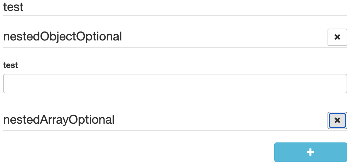
When enabled for either (or both) the array or object types, any optional object or array field which has an "undefined" value in formData will NOT render any of the container's UI elements.
Instead the object/array container's field title will have an "Add optional data" icon button that, when clicked will cause an empty container data element to be added to formData.
When enabled for either (or both) the array or object types, any optional object or array field which has an "defined" value in formData will render all of the container's UI elements as normal AND the object/array container's field title will have a "Remove optional data" icon button that, when clicked will set the data for field in the formData to "undefined".
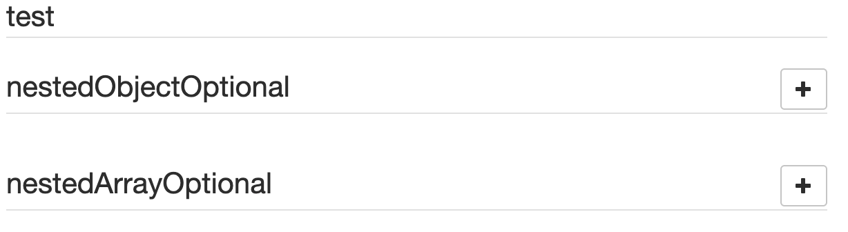
Here is an example of what the UI will look like when enabled using the following Form configuration:
const schema: RJSFSchema = {
  title: 'test',
  properties: {
    nestedObjectOptional: {
      type: 'object',
      properties: {
        test: {
          type: 'string',
        },
      },
    },
    nestedArrayOptional: {
      type: 'array',
      items: {
        type: 'string',
      },
    },
  },
};
const uiSchema = {
  'ui:globalOptions': {
    enableOptionalDataFieldForType: ['object', 'array'],
  },
};
const experimental_defaultFormStateBehavior = {
  // Set the emptyObjectFields to only populate required defaults to highlight the code working
  emptyObjectFields: 'populateRequiredDefaults',
};

render(
  <Form
    schema={schema}
    validator={validator}
    uiSchema={uiSchema}
    experimental_defaultFormStateBehavior={experimental_defaultFormStateBehavior}
    templates={{ OptionalDataControlsTemplate }}
  />,
  document.getElementById('app'),
);
Add Optional Data Controls
Remove Optional Data Controls
emptyValue
The ui:emptyValue uiSchema directive provides the default value to use when an input for a field is empty
enumDisabled
To disable an option, use the enumDisabled property in uiSchema.
import { RJSFSchema, UiSchema } from '@rjsf/utils';

const schema: RJSFSchema = {
  type: 'string',
  enum: ['one', 'two', 'three'],
};

const uiSchema: UiSchema = {
  'ui:enumDisabled': ['two'],
};
enumNames
Allows a user to provide labels for enum values in the schema. Can be an array (matched by index) or a map (matched by value).
import { RJSFSchema, UiSchema } from '@rjsf/utils';

const schema: RJSFSchema = {
  type: 'number',
  enum: [1, 2, 3],
};

// Array form (matched by index)
const uiSchemaArray: UiSchema = {
  'ui:enumNames': ['one', 'two', 'three'],
};

// Map form (matched by value)
const uiSchemaMap: UiSchema = {
  'ui:enumNames': { 1: 'one', 2: 'two', 3: 'three' },
};
enumOrder
Controls the display order of enum options. Use '*' to represent remaining values in their original schema order. Unlisted values not covered by '*' are dropped.
import { RJSFSchema, UiSchema } from '@rjsf/utils';

const schema: RJSFSchema = {
  type: 'string',
  enum: ['apple', 'banana', 'cherry', 'date'],
};

const uiSchema: UiSchema = {
  'ui:enumOrder': ['cherry', '*', 'apple'],
};
filePreview
The FileWidget can be configured to show a preview of an image or a download link for non-images using this flag.
import { RJSFSchema, UiSchema } from '@rjsf/utils';

const schema: RJSFSchema = {
  type: 'string',
  format: 'data-url',
};
const uiSchema: UiSchema = {
  'ui:options': {
    filePreview: true,
  },
};
help
Sometimes it's convenient to add text next to a field to guide the end user filling it. This is the purpose of the ui:help uiSchema directive:
import { RJSFSchema, UiSchema } from '@rjsf/utils';

const schema: RJSFSchema = { type: 'string' };
const uiSchema: UiSchema = {
  'ui:widget': 'password',
  'ui:help': 'Hint: Make it strong!',
};

Help texts work for any kind of field at any level, and will always be rendered immediately below the field component widget(s) (after contextualized errors, if any).
hideError
The ui:hideError uiSchema directive will, if set to true, hide the default error display for the given field AND all of its child fields in the hierarchy.
If you need to enable the default error display of a child in the hierarchy after setting hideError: true on the parent field, simply set hideError: false on the child.
This is useful when you have a custom field or widget that utilizes either the rawErrors or the errorSchema to manipulate and/or show the error(s) for the field/widget itself.
inputType
To change the input type (for example, tel or email) you can specify the inputType in the ui:options uiSchema directive.
import { RJSFSchema, UiSchema } from '@rjsf/utils';

const schema: RJSFSchema = { type: 'string' };
const uiSchema: UiSchema = {
  'ui:options': {
    inputType: 'tel',
  },
};
label
Field labels are rendered by default.
Labels may be omitted on a per-field by setting the label option to false in the ui:options uiSchema directive.
import { Form } from '@rjsf/core';
import { RJSFSchema, UiSchema } from '@rjsf/utils';
import validator from '@rjsf/validator-ajv8';

const schema: RJSFSchema = { type: 'string' };
const uiSchema: UiSchema = {
  'ui:options': {
    label: false,
  },
};

render(<Form schema={schema} uiSchema={uiSchema} validator={validator} />, document.getElementById('app'));
They can also be omitted globally by setting the label option to false in the ui:globalOptions uiSchema directive.
import { Form } from '@rjsf/core';
import { RJSFSchema, UiSchema } from '@rjsf/utils';
import validator from '@rjsf/validator-ajv8';

const schema: RJSFSchema = { type: 'string' };
const uiSchema: UiSchema = {
  'ui:globalOptions': {
    label: false,
  },
};

render(<Form schema={schema} uiSchema={uiSchema} validator={validator} />, document.getElementById('app'));
optionValueFormat
Controls how enum-backed widgets (select, radio, checkboxes) encode option values in their DOM value attributes. Accepts 'indexed' (default) or 'realValue'.
'indexed': options are encoded as their array index (e.g.value="0",value="1"). This is the historical behavior and keeps non-primitive enum values (objects, arrays) addressable without stringifying them.'realValue': primitive option values are stringified directly (e.g.value="admin",value="42",value="true"). This enables native HTML form submission and browser autocomplete since the submitted value matches the enum value. Non-primitive values (objects, arrays) still fall back to their index becauseString(obj)would produce"[object Object]".
The form data passed to onChange is always the typed enum value; this option only affects the DOM-level encoding. Can be specified in ui:globalOptions to apply to all enum-backed fields, or per-field in ui:options.
import { Form } from '@rjsf/core';
import { RJSFSchema, UiSchema } from '@rjsf/utils';
import validator from '@rjsf/validator-ajv8';

const schema: RJSFSchema = {
  type: 'object',
  properties: {
    role: { type: 'string', enum: ['admin', 'editor', 'viewer'] },
  },
};

// Form-wide
const uiSchema: UiSchema = {
  'ui:globalOptions': {
    optionValueFormat: 'realValue',
  },
};

// Or per-field
const fieldUiSchema: UiSchema = {
  role: {
    'ui:options': {
      optionValueFormat: 'realValue',
    },
  },
};

render(<Form schema={schema} uiSchema={uiSchema} validator={validator} />, document.getElementById('app'));
order
This property allows you to reorder the properties that are shown for a particular object. See Objects for more information.
placeholder
You can add placeholder text to an input by using the ui:placeholder uiSchema directive:
import { Form } from '@rjsf/core';
import { RJSFSchema, UiSchema } from '@rjsf/utils';
import validator from '@rjsf/validator-ajv8';

const schema: RJSFSchema = { type: 'string', format: 'uri' };
const uiSchema: UiSchema = {
  'ui:placeholder': 'http://',
};

render(<Form schema={schema} uiSchema={uiSchema} validator={validator} />, document.getElementById('app'));
Fields using enum can also use ui:placeholder. The value will be used as the text for the empty option in the select widget.
import { Form } from '@rjsf/core';
import { RJSFSchema, UiSchema } from '@rjsf/utils';
import validator from '@rjsf/validator-ajv8';

const schema: RJSFSchema = { type: 'string', enum: ['First', 'Second'] };
const uiSchema: UiSchema = {
  'ui:placeholder': 'Choose an option',
};

render(<Form schema={schema} uiSchema={uiSchema} validator={validator} />, document.getElementById('app'));
readonly
The ui:readonly uiSchema directive will mark all child widgets from a given field as read-only. This is equivalent to setting the readOnly property in the schema.
Note: If you're wondering about the difference between a
disabledfield and areadonlyone: Marking a field as read-only will render it greyed out, but its text value will be selectable. Disabling it will prevent its value to be selected at all.
rows
You can set the initial height of a textarea widget by specifying rows option.
import { Form } from '@rjsf/core';
import { RJSFSchema, UiSchema } from '@rjsf/utils';
import validator from '@rjsf/validator-ajv8';

const schema: RJSFSchema = { type: 'string' };
const uiSchema: UiSchema = {
  'ui:options': {
    widget: 'textarea',
    rows: 15,
  },
};

render(<Form schema={schema} uiSchema={uiSchema} validator={validator} />, document.getElementById('app'));
title
Sometimes it's convenient to change a field's title. This is the purpose of the ui:title uiSchema directive:
import { RJSFSchema, UiSchema } from '@rjsf/utils';

const schema: RJSFSchema = { type: 'string' };
const uiSchema: UiSchema = {
  'ui:widget': 'password',
  'ui:title': 'Your password',
};
submitButtonOptions
Sometimes it's convenient to change the behavior of the submit button for the form. This is the purpose of the ui:submitButtonOptions uiSchema directive:
You can pass any other prop to the submit button if you want, by default, this library will set the following options / props mentioned below for all submit buttons:
norender option
You can set this property to true to remove the submit button completely from the form. Nice option, if the form is just for viewing purposes.
submitText option
You can use this option to change the text of the submit button. Set to "Submit" by default.
props section
You can pass any other prop to the submit button if you want, via this section.
disabled prop
You can use this option to disable the submit button.
className prop
You can use this option to specify a class name for the submit button.
import { UiSchema } from '@rjsf/utils';

const uiSchema: UiSchema = {
  'ui:submitButtonOptions': {
    props: {
      disabled: false,
      className: 'btn btn-info',
    },
    norender: false,
    submitText: 'Submit',
  },
};
duplicateKeySuffixSeparator option
When using additionalProperties, key collision is prevented by appending a unique integer suffix to the duplicate key.
For example, when you add a key named myKey to a form where myKey is already defined, then your new key will become myKey-1.
You can use ui:duplicateKeySuffixSeparator to override the default separator, "-" with a string of your choice on a per-field basis.
You can also set this in the ui:globalOptions to have the same separator used everywhere.
import { UiSchema } from '@rjsf/utils';

const uiSchema = {
  'ui:globalOptions': {
    duplicateKeySuffixSeparator: '_',
  },
};
Using uiSchema with oneOf, anyOf
anyOf
The uiSchema will work with elements inside an anyOf as long as the uiSchema defines the anyOf key at the same level as the anyOf within the schema.
Because the anyOf in the schema is an array, so must be the one in the uiSchema.
If you want to override the titles of the first two elements within the anyOf list you would do the following:
import { RJSFSchema, UiSchema } from '@rjsf/utils';

const schema: RJSFSchema = {
  type: 'object',
  anyOf: [
    {
      title: 'Strings',
      type: 'string',
    },
    {
      title: 'Numbers',
      type: 'number',
    },
    {
      title: 'Booleans',
      type: 'boolean',
    },
  ],
};

const uiSchema: UiSchema = {
  anyOf: [
    {
      'ui:title': 'Custom String Title',
    },
    {
      'ui:title': 'Custom Number Title',
    },
  ],
};
NOTE: Because the third element in the
schemadoes not have an associated element in theuiSchema, it will keep its original title.
oneOf
The uiSchema will work with elements inside an oneOf as long as the uiSchema defines the oneOf key at the same level as the oneOf within the schema.
Because the oneOf in the schema is an array, so must be the one in the uiSchema.
If you want to override the titles of the first two elements within the oneOf list you would do the following:
import { RJSFSchema, UiSchema } from '@rjsf/utils';

const schema: RJSFSchema = {
  type: 'object',
  oneOf: [
    {
      title: 'Strings',
      type: 'string',
    },
    {
      title: 'Numbers',
      type: 'number',
    },
    {
      title: 'Booleans',
      type: 'boolean',
    },
  ],
};

const uiSchema: UiSchema = {
  oneOf: [
    {
      'ui:title': 'Custom String Title',
    },
    {
      'ui:title': 'Custom Number Title',
    },
  ],
};
NOTE: Because the third element in the
schemadoes not have an associated element in theuiSchema, it will keep its original title.