Widgets
The uiSchema ui:widget property tells the form which UI widget should be used to render a field.
Example:
import Form from '@rjsf/core';
import { RJSFSchema, UiSchema } from '@rjsf/utils';
import validator from '@rjsf/validator-ajv8';

const schema: RJSFSchema = {
  type: 'object',
  properties: {
    done: {
      type: 'boolean',
    },
  },
};

const uiSchema: UiSchema = {
  done: {
    'ui:widget': 'radio', // could also be "select"
  },
};

render(<Form schema={schema} uiSchema={uiSchema} validator={validator} />, document.getElementById('app'));
Here's a list of supported alternative widgets for different JSON Schema data types:
For boolean fields
radio: a radio button group withtrueandfalseas selectable values;select: a select box withtrueandfalseas options;- by default, a checkbox is used
Note: To set the labels for a boolean field, instead of using
trueandfalse, your schema can useoneOfwithconstvalues for both true and false, where you can specify the custom label in thetitlefield. You will also need to specify a widget in youruiSchema. See the following example:
schema:
{
  "properties": {
    "booleanWithCustomLabels": {
      "type": "boolean",
      "oneOf": [
        { "const": true, "title": "Custom label for true" },
        { "const": false, "title": "Custom label for false" }
      ]
    }
  }
}
uiSchema:
{
  "booleanWithCustomLabels": {
    "ui:widget": "radio" // or "select"
  }
}
For string fields
textarea: atextareaelement is used;password: aninput[type=password]element is used;color: aninput[type=color]element is used;- by default, a regular
input[type=text]element is used.
String formats
The built-in string field also supports the JSON Schema format property, and will render an appropriate widget by default for the following string formats:
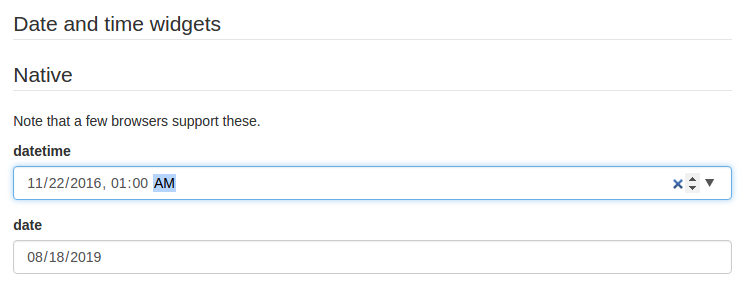
email: Aninput[type=email]element is used;uri: Aninput[type=url]element is used;data-url: By default, aninput[type=file]element is used; in case the string is part of an array, multiple files will be handled automatically (see File widgets).date: By default, aninput[type=date]element is used;date-time: By default, aninput[type=datetime-local]element is used.time: By default aninput[type=time]element is used;
Please note that, even though they are standardized, datetime-local, date and time input elements are not supported by IE. If you plan on targeting IE, two alternative widgets are available:
alt-datetime: Sixselectelements are used to select the year, the month, the day, the hour, the minute and the second;alt-date: Threeselectelements are used to select the year, month and the day.

You can customize the list of years displayed in the year dropdown by providing a yearsRange property to ui:options in your uiSchema.
The range can be descending by specifying the larger value first.
It's also possible to remove the Now and Clear buttons with the hideNowButton and hideClearButton options.
You can also, customize the order in which date input fields are displayed by providing format property to ui:options in your uiSchema, available values are YMD(default), MDY and DMY.
import Form from '@rjsf/core';
import { RJSFSchema, UiSchema } from '@rjsf/utils';
import validator from '@rjsf/validator-ajv8';

const schema: RJSFSchema = {
  type: 'string',
};

const uiSchema: UiSchema = {
  'ui:widget': 'alt-datetime',
  'ui:options': {
    yearsRange: [1980, 2030],
    format: 'MDY',
    hideNowButton: true,
    hideClearButton: true,
  },
};

render(<Form schema={schema} uiSchema={uiSchema} validator={validator} />, document.getElementById('app'));
You can also specify negative values which will be treated relative to the current year, so if it is 2020 and the range is set as follows.
yearsRange: [-120, -18],
Years from 1900-2002 will be shown. You can also specify the dates with the higher date first to display dates in reverse order.
   yearsRange: [2030, 1980],
   ...
   yearsRange: [-18, -120],
Years from 2030-1980 and 2002-1900, respectively will be shown.
For number and integer fields
updown: aninput[type=number]updown selector;range: aninput[type=range]slider;radio: a radio button group with enum values. This can only be used whenenumvalues are specified for this input.- By default, a regular
input[type=number]element is used.
Note: If JSON Schema's
minimum,maximumandmultipleOfvalues are defined, themin,maxandstepinput attributes values will take those values.
Hidden widgets
It's possible to use a hidden widget for a field by setting its ui:widget uiSchema directive to hidden:
import Form from '@rjsf/core';
import { RJSFSchema, UiSchema } from '@rjsf/utils';
import validator from '@rjsf/validator-ajv8';

const schema: RJSFSchema = {
  type: 'object',
  properties: {
    foo: { type: 'boolean' },
  },
};

const uiSchema: UiSchema = {
  foo: { 'ui:widget': 'hidden' },
};

render(<Form schema={schema} uiSchema={uiSchema} validator={validator} />, document.getElementById('app'));
Notes:
- Hiding widgets is only supported for
boolean,string,numberandintegerschema types; - A hidden widget takes its value from the
formDataprop.
File widgets
This library supports a limited form of input[type=file] widgets, in the sense that it will propagate file contents to form data state as data-urls.
There are two ways to use file widgets.
- By declaring a
stringjson schema type along adata-urlformat:
import Form from '@rjsf/core';
import { RJSFSchema } from '@rjsf/utils';
import validator from '@rjsf/validator-ajv8';

const schema: RJSFSchema = {
  type: 'string',
  format: 'data-url',
};

render(<Form schema={schema} validator={validator} />, document.getElementById('app'));
- By specifying a
ui:widgetfield uiSchema directive asfile:
import { RJSFSchema, UiSchema } from '@rjsf/utils';

const schema: RJSFSchema = {
  type: 'string',
};

const uiSchema: UiSchema = {
  'ui:widget': 'file',
};
Multiple files
Multiple files selectors are supported by defining an array of strings having data-url as a format:
import { RJSFSchema } from '@rjsf/utils';

const schema: RJSFSchema = {
  type: 'array',
  items: {
    type: 'string',
    format: 'data-url',
  },
};
Note that storing large dataURIs into form state might slow rendering.
File widget input ref
The included FileWidget exposes a reference to the <input type="file" /> element node as an inputRef component property.
This allows you to programmatically trigger the browser's file selector, which can be used in a custom file widget.
accept option
You can use the accept attribute to specify a filter for what file types the user can upload:
import { RJSFSchema, UiSchema } from '@rjsf/utils';

const schema: RJSFSchema = {
  type: 'string',
  format: 'data-url',
};

const uiSchema: UiSchema = {
  'ui:options': { accept: '.pdf' },
};